QcDesign
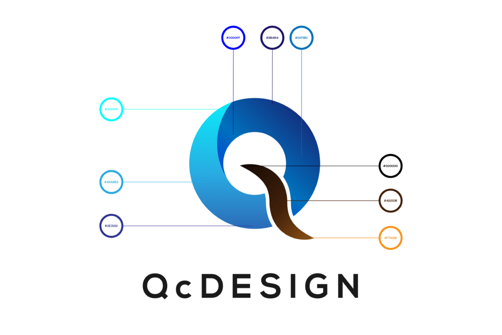
Let’s start with our very own logomark. Intended to be a significant part of the brand, we had to make it special.
As previously noted, we like take inspiration from the surroundings as well as honor our Customers for trusting us. We took an advantage of both, taking the shapes and the colors from intentionally oversaturated photographs of our female Model.
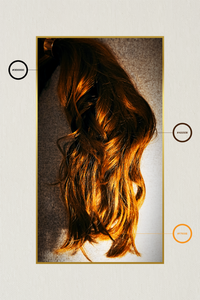
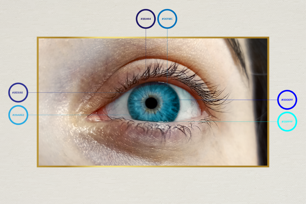
The bright and vibrant shades of eye lens blue balances out the flaming browns of hair locks. Both blue and brown tones work together as a study in contrast, forming a complementary, modern looking letter of Q.